In this post (together with a second part) we are going to talk about the basic principles or fundamentals of design. It will be very focused on web design as it is my specialty, but it can be transferred to the vast majority of projects both online and offline.
In today's hyper-stimulated society, getting attention for more than 10 seconds sometimes becomes a real challenge.
Today and in the next post we will see how you can improve and better connect with the user, give rhythm and do not bore with your design, generate more confidence and organize a structure that does not stress our dear and precious viewer.
I don't want to be so pretentious as to call it a guide, as these are just brush strokes of something that has been written about in many different books.
It would be something like a quick and painless summary, with some examples and tips that I usually take into account in my day-to-day work.
What I am (at 97%) sure, is that it can be useful for you if you are in the design world and you can get something new, or if you do not know these principles and you can use them to have a global vision, synthesized, and a best criterion to implement in future projects.
Today we will touch on the first 5 points, so let's get down to business.
Fundamentals
of the design
Design features to consider
The objectives
The design must be in line with the objectives of the project. It must eliminate the need to think and make it connect with the potential client, so that he/she consumes our message, remembers us and performs a specific action.
Design VS Functionality
A good design should display content in the most attractive way possible, but unless it is done intentionally for strategic objectives, it should be prioritizing functionality and content over aesthetics.
Visual composition
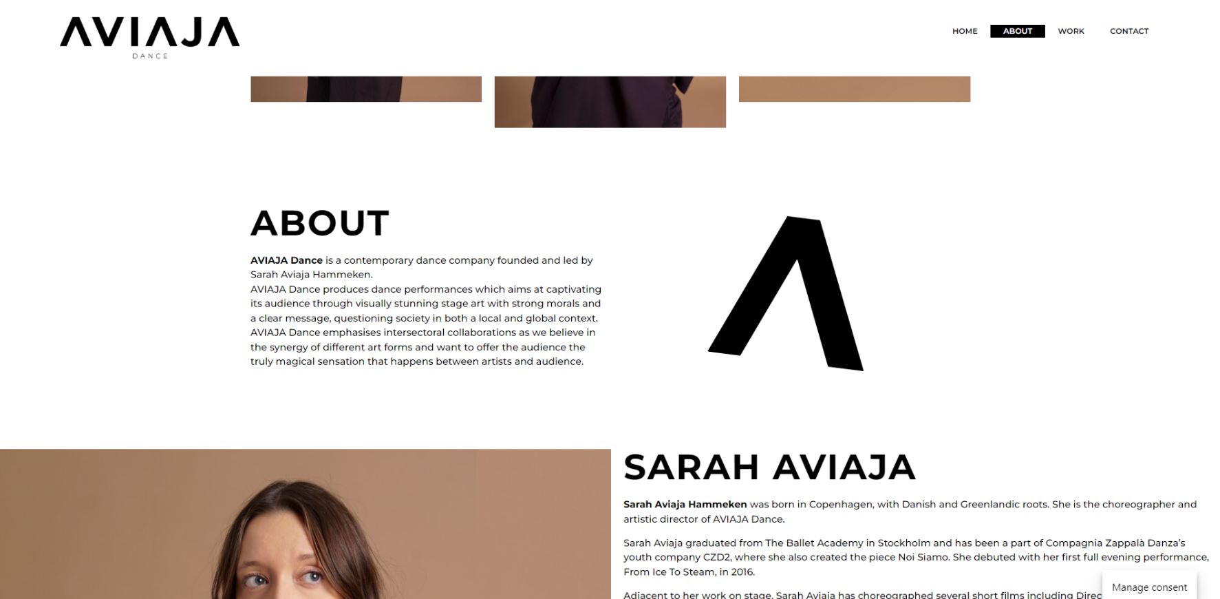
Simple works. Elements should not be added or used because the competition or other companies do it, everything should be there for a strategic reason. It has to be pleasing, and the elements have to coexist in harmony.
Design is not art
Many times we talk about "I like it / I don't like it". And this as professionals is something that we should not encourage, since design should be more similar to science (method) or psychology than to art.
Let's start
01
Fundamentals of design
Proximity
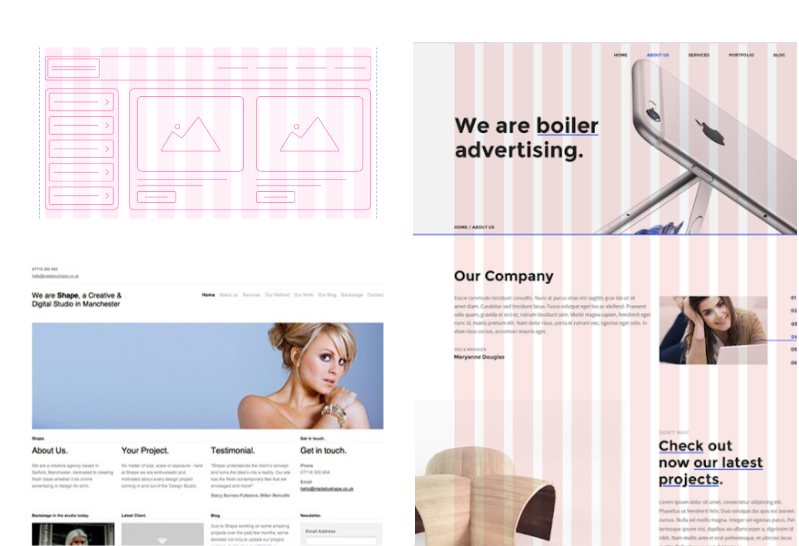
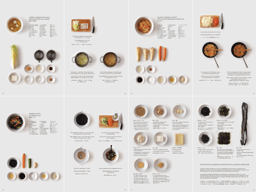
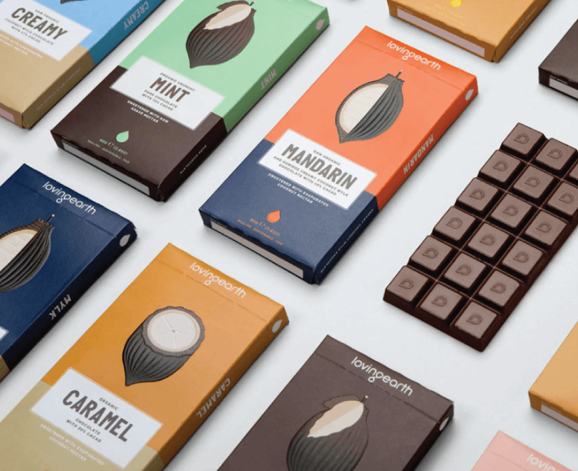
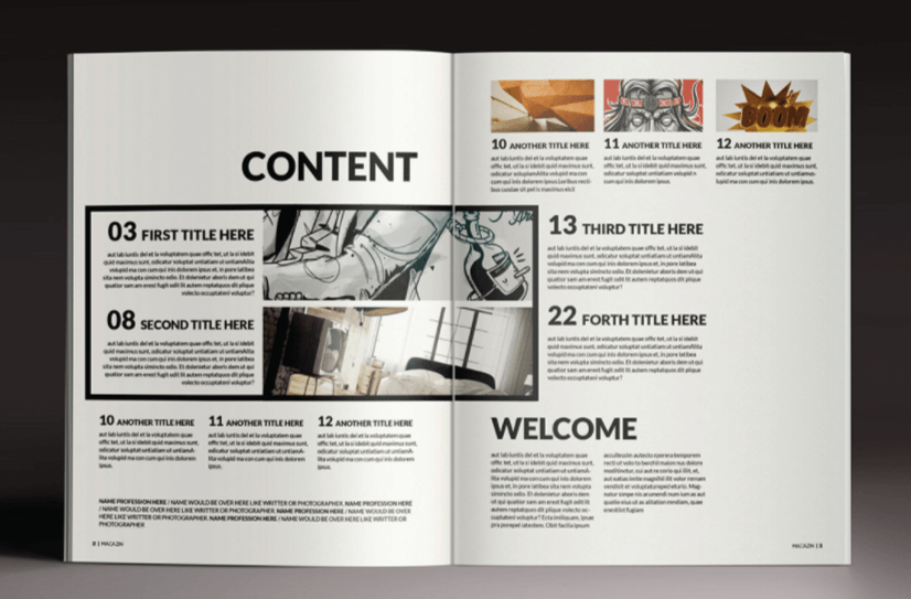
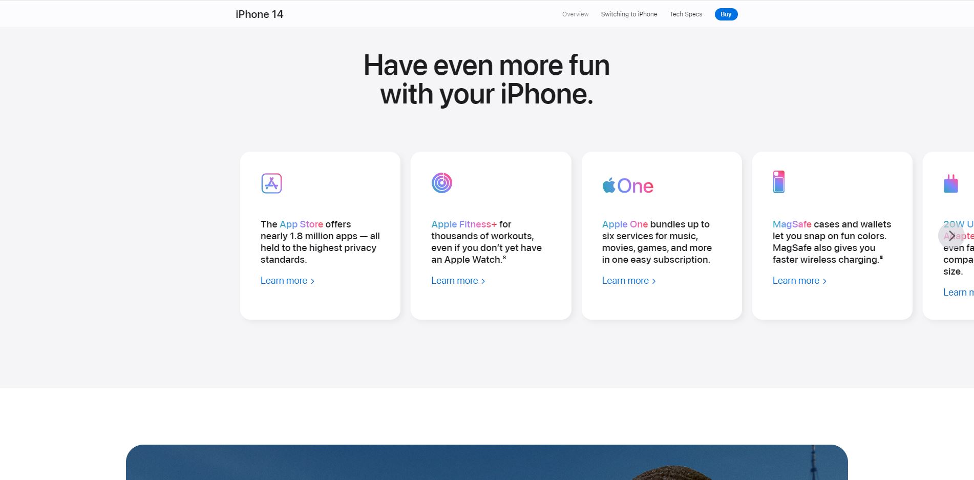
Organize the elements that belong to the same unit, group them together and differentiate them from the other units in order to offer the clearest possible structure.
So far so tidy
but a bit boring, isn't it? that's what the next foundation is for.
04.
The contrast
What is it for?
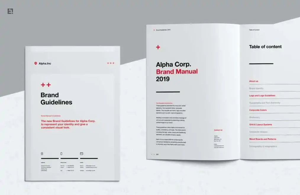
- So as not to fall into the monotony and boredom of the principle of repetition.
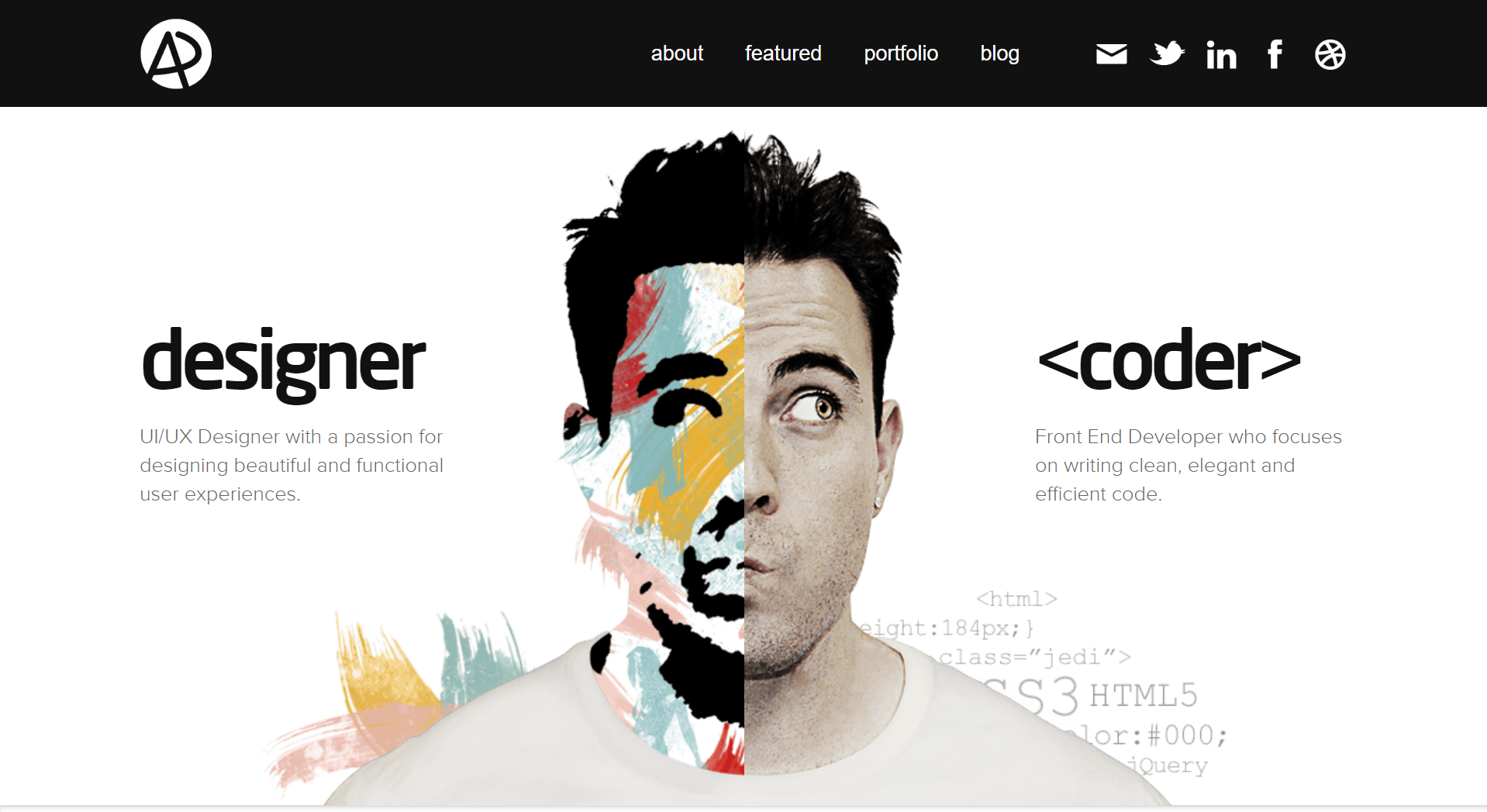
- Highlight specific elements that we are interested in that capture attention and guide the user to those points.
Tips:
- Avoid having similar elements, are either the same or completely different.
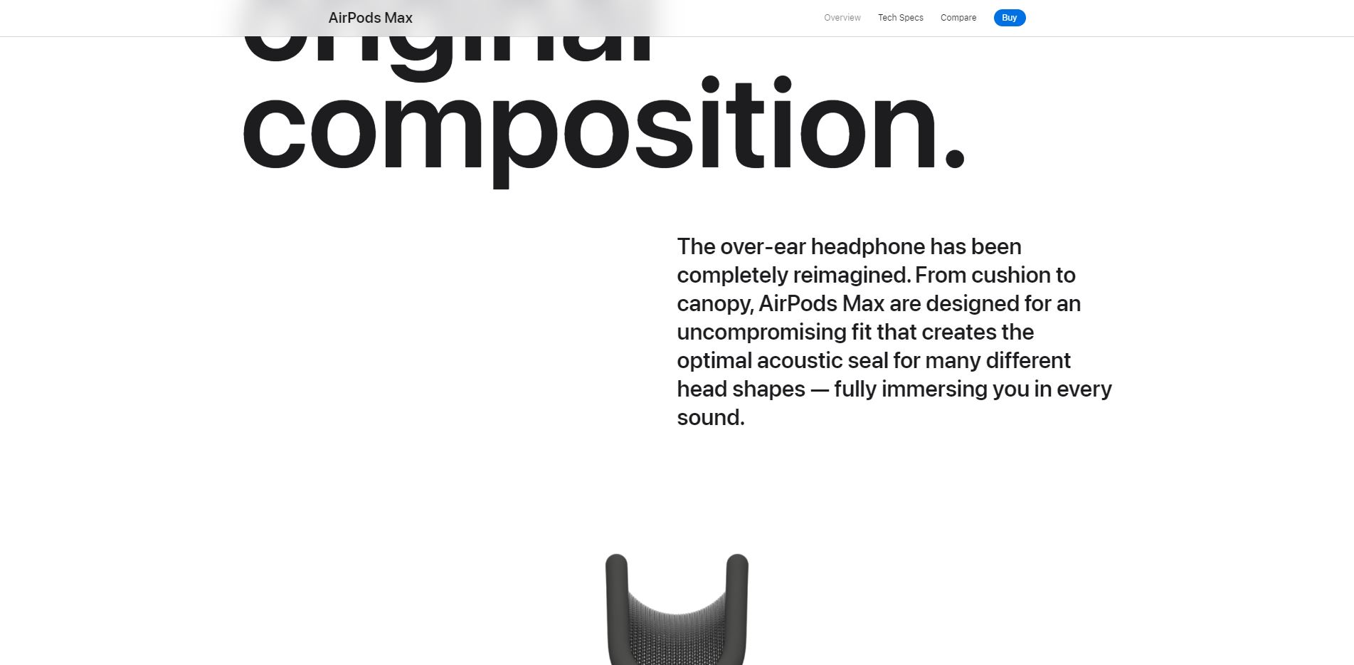
Be subtle, do not highlight everything, otherwise nothing stands out. If the visitor does not know where to click, he is lost and conversions are low.
- Safe bet: color scales using blacks, whites and a deep color (blue, red, green), always work well in terms of contrast and conversions.
05
Balance
Weights of the
elements
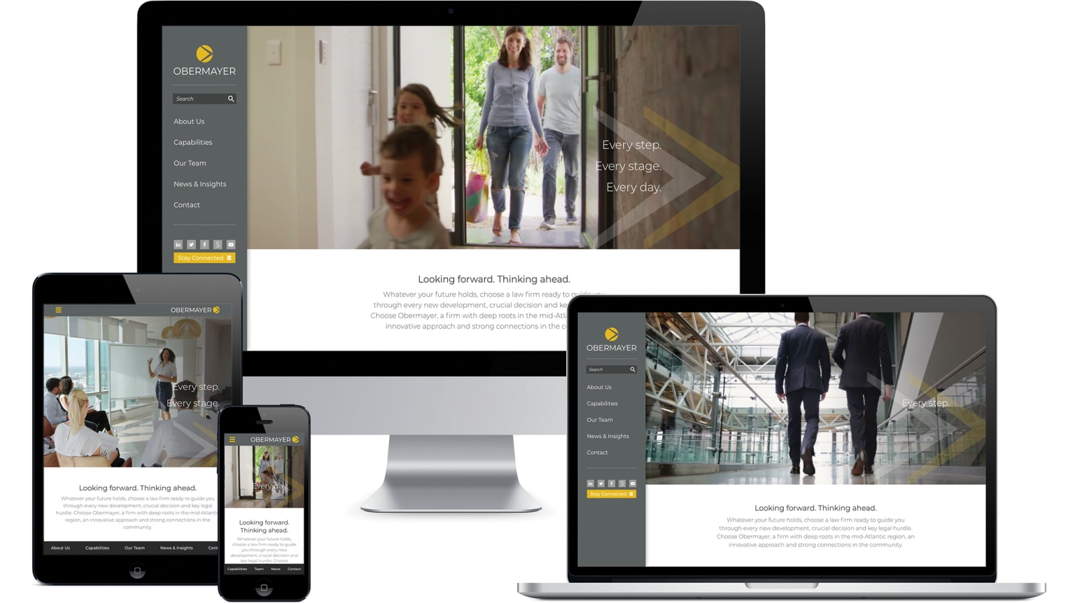
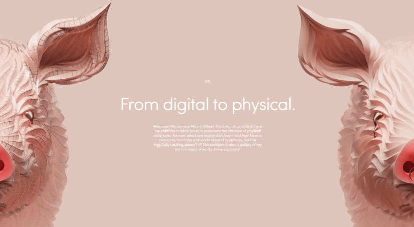
- A block of intense color carries more weight than an image.
- An image carries more weight than plain text.
- A bold or large typeface is heavier than light text and can balance an image.
- Black outweighs white.
- ...But a white dot on black attracts more attention than the other way around.
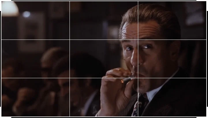
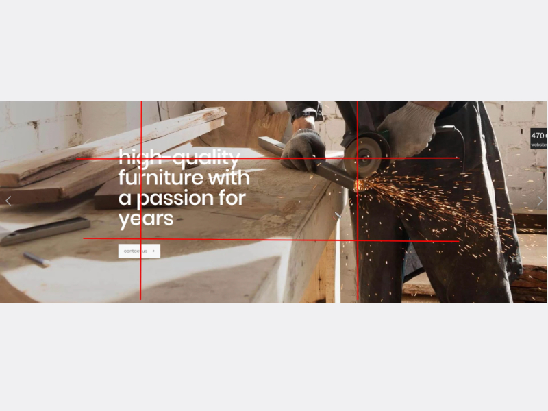
- Take into account the 2/3 rule.
- In case of having to put a dark block, do it below.
Well, so far we have seen this first part, these fundamentals are quite basic, but in the next post we will touch some in the fundamentals of design where I usually see how many people make serious mistakes that generate stress to the user, make them distrust your content or make them not connect with our beloved and valued viewers.
See you soon ツ

