Digital accessibility is becoming a priority, especially in Spain, where it is becoming a priority, especially in Spain, where accessibility legislation based on the European Directive will come into force in June 2025..
This regulation requires digital products such as mobile apps or websites to comply with WCAG 2.1 level AA accessibility standards. Designers and developers have a responsibility to ensure that their products are inclusive, readable and compliant with the law.
However, accessibility is not only a legal obligation, but also an opportunity to create better user experiences. To this end, it is crucial to understand how design affects different people and scenarios, from users with permanent visual impairments to temporary situations, such as those resulting from intense ambient light or eye strain that hinders the legibility and perception of content.
Key dates to keep in mind with accessibility regulation in Spain
The Law 11/2023, based on the European Accessibility Act, establishes the deadlines and requirements to ensure that products and services are accessible:
- New products and servicesThey must comply with the accessibility requirements as from June 28, 2025.
- Services based on existing products or previous contracts with management as of June 28, 2025: You have until June 29, 2030 to adapt.
- Self-service terminals installed by June 28, 2025Accessibility: Its accessibility should be implemented at the end of its economic useful life, with a maximum limit of 10 years since installation.
Main visual syndromes
Visual accessibility is profoundly influenced by how the human eye perceives color, light and contrast. The main visual syndromes present in the world population are:
- Color blindness:
- It affects approximately 8% of men and 0.5% of women worldwide.
- Difficulty distinguishing certain colors, such as red and green or blue and yellow.
- Low vision:
- Associated with diseases such as glaucoma or macular degeneration.
- It represents about 2-3% of the population.
- Photophobia:
- Hypersensitivity to bright light.
- It may be related to migraines or ocular lesions.

Global statistics:
- More of 2.2 billion people have some type of visual impairment, according to the World Health Organization (WHO).
- Around 80% of vision problems are preventable or treatable, but should be considered in the design of digital products.
To learn more about the physiology of the eye and how it affects contrast and color perception, please visit this website: https://colorandcontrast.com/
Physiology of the human eye and visual accessibility
The human eye is an organ that enables visual perception by capturing and processing light. Light enters through the pupil, whose opening is regulated by the iris to control the amount of incoming light.
Behind the pupil is the crystalline, a flexible lens that adjusts its shape to focus on objects at different distances, projecting the inverted image onto the retina at the back of the eye.
The retina contains photoreceptors responsible for transforming light into electrical signals that are sent to the brain via the optic nerve.
Retinal photoreceptors are divided into two main types:
- CanesVision: Responsible for vision in low light conditions, essential for night vision.
- ConesThey allow the perception of color and are divided into:
- L ConesSensitive to red light.
- Cones MSensitive to green light.
- Cones SSensitive to blue light.
When any of these cones is defective or absent, different forms of color blindness occur:
- DeuteranopiaDeficit in the M cones, which hinders the perception of green.
- ProtanopiaDeficits in the L cones, affecting the perception of red.
- TritanopiaDeficits in the S cones, altering the perception of blue and yellow.
These alterations affect the ability to distinguish certain colors and may vary in intensity depending on the severity of the cone deficit.
To learn more about the physiology of the eye and how it affects contrast and color perception, please visit this website: https://colorandcontrast.com/

WCAG 2.1 and Perceptual Models: Modern Guidelines and Standards
What is WCAG?
The Web Content Accessibility Guidelines (WCAG) are a set of recommendations developed by the World Wide Web Consortium (W3C) to make websites, applications and other digital content more accessible. These guidelines are structured into three levels of conformance:
- Level ABasic requirements that all content must meet to be accessible.
- Level AAAdditional standards that improve accessibility for a wider audience, required by European legislation.
- Level AAAAdvanced criteria that ensure maximum accessibility, although full compliance is not always practical.
The WCAG are organized around four fundamental principles: Perceptible, Operable, Understandable and Robust. These guidelines are constantly evolving, with version 2.1 incorporating additional criteria for mobile devices and people with cognitive disabilities. The goal is to ensure that any user, regardless of their abilities, can interact with digital content effectively and equitably.
Basic principles of WCAG 2.1
The four fundamental principles are:
- PerceptibleEnsure that the content is visible and understandable.
- OperableDesign functional interfaces for all devices.
- UnderstandableCreate intuitive and predictable interactions.
- Robust: Ensure compatibility with assistive technologies.
What is the color contrast ratio?
The color contrast ratio falls into the Perceptible category and measures the difference between the brightness of two colors, such as text and background, to ensure that they are distinguishable. It is expressed as a ratio (e.g. 4:1), where higher values indicate higher contrast.
Adequate contrast ensures that content is readable by people with visual impairments or in unfavorable lighting conditions. WCAG 2.1 establishes minimum ratios to meet accessibility standards:
- Normal text: 4.5:1.
- Large text: 3:1.
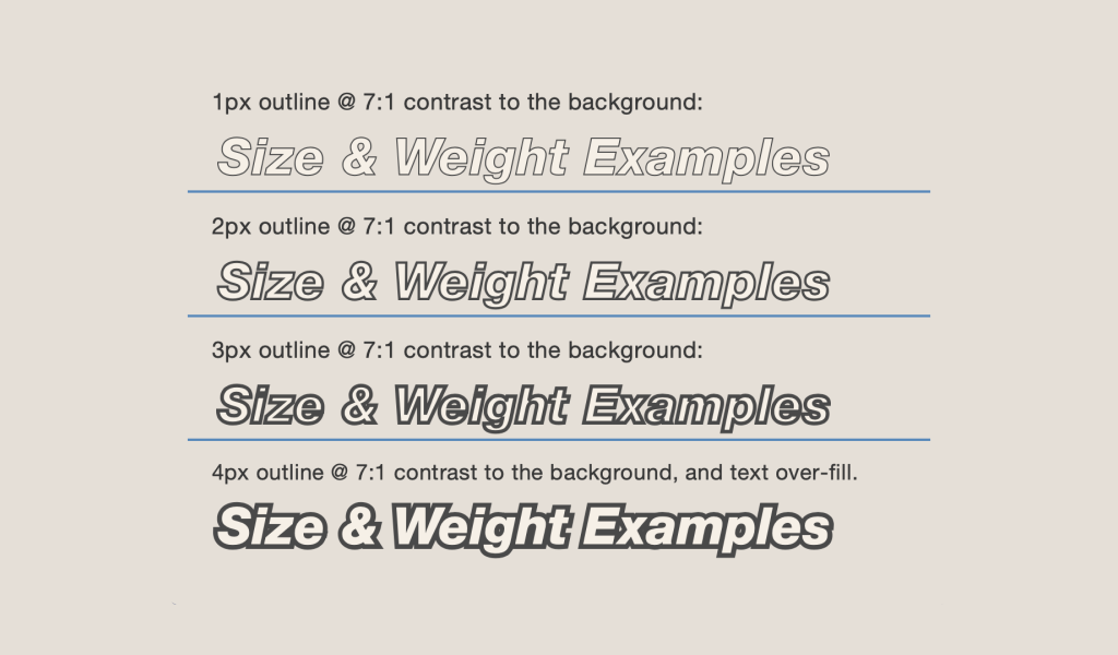
The main problems with this formula stem from the fact that the low contrast calculation is based on relative luminance, but does not consider how users perceive colors in real-life contexts. Technically contrasting colors may appear very similar visually. In addition, WCAG 2.1 allows a lower contrast ratio for large text (3:1), but this can be misleading if the font has a thin thickness, as the perception of contrast decreases.
This often results in frustration on the part of digital product designers as many of them have the perception that complying with WCAG limits creativity and leads to less attractive, look-alike or overly functional interfaces.
APCA (Advanced Perceptual Contrast Algorithm)
APCA is an experimental model developed to improve the way contrast is measured in digital designs. This model, still under revision, is scheduled to be officially adopted as part of the future WCAG 3.0. It is intended to address the limitations of the current WCAG 2.1 relative luminance-based model.
Advantages of APCA:
- It considers human factors such as:
- Text size and font thickness.
- Visual environment and lighting conditions.
- Real perceptibility based on user experience.
- Provides more realistic and effective adaptive contrasts, surpassing the fixed rules of 4.5:1 and 3:1.
Although it is not yet an official standard, APCA is already being integrated into tools such as Stark, The color tokenization process, allowing designers to test and adapt before formal adoption. To implement these guidelines efficiently, modern tools and color tokens are key.
Creation of accessible palettes: construction and semantic usage
Designing accessible palettes involves balancing visual aesthetics with accessibility requirements. This process consists of two major stages: the creation of a tonal matrix with equivalent jumps in brightness and the semantic configuration of the selected colors. Once these stages are completed in light mode, the contrasts are checked before transferring the semantic palette to dark mode.
Key principles for creating accessible palettes
- Proportional contrastIt is essential to maintain a minimum contrast of 4.5:1 for normal text and 3:1 for large text, ensuring legibility. Using APCA the safe values would be at minimum Lc30 for disabled text up to Lc 75 for the main running text.
- Scalable color systemCreate consistent color scales with proportional brightness. Each color should have different shades for use in light and dark contexts.
- Tests in real contextTesting colors on real interfaces and under different lighting conditions, simulating end-user scenarios.
- Avoid exclusive reliance on colorUse additional patterns, labels or shapes to convey information, rather than relying solely on color.
Construction of the Tonal Matrix
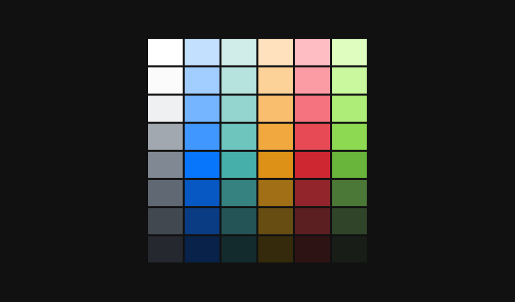
The tonal matrix is the starting point for creating an accessible palette. This step consists of defining fundamental colors (such as primary, secondary and accent colors, as well as grayscale or neutral tones) and generating shades derived from these colors. The shades should maintain proportional differences in brightness, which facilitates their use in different contexts, such as backgrounds, text and interactive elements.
A scalable color system ensures that each base color has light, medium and dark versions, adapting to both light and dark modes. It is important to validate that these scales maintain adequate contrast, complying with the minimum ratios required by the WCAG (4.5:1 for normal text and 3:1 for large text).
To facilitate this task there are numerous tools, each with a slightly different approach, that allow us to create our tonal matrices and even export them to Figma:
- Color x ColorTonal Arrays: Allows you to define tonal arrays with different types of step interpolation curves. This allows you to create unique and visually more attractive palettes.
- First PrismThe official matrix creation tool of the GitHub design team. Allows for more manual control and adjustment on a proportionally generated basis.
- ColorspaceIt is a much simpler configuration tool, but allows a lower degree of customization. It is the most suitable for a first introduction to tonal matrices, since it also incorporates a 3D model for visualization of the matrix in different color models such as OKLCH.
Semantic Color Configuration
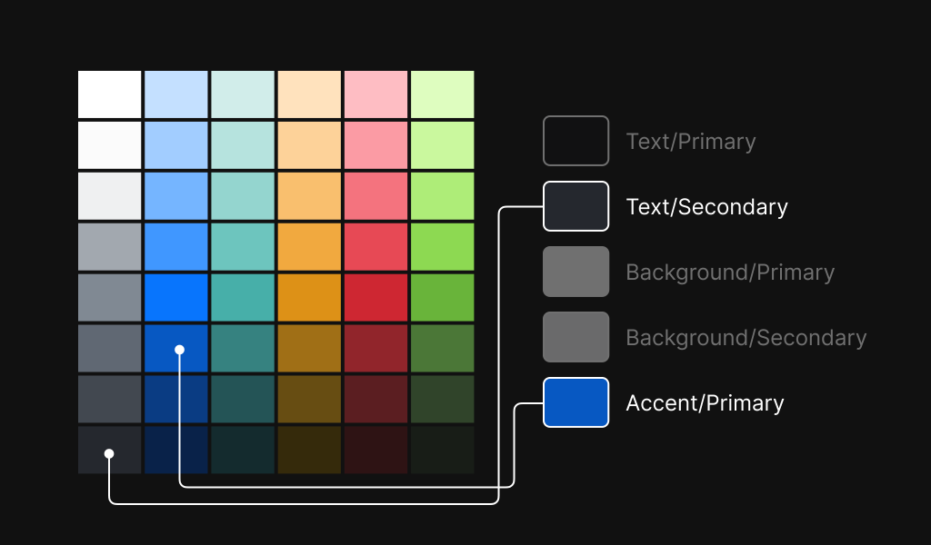
Once the tonal matrix has been created, the next step is to assign a functional meaning to each tone. For example, you can define colors for text importance as follows primary, secondary o tertiary. This semantic approach ensures that colors have a clear purpose within the interface and improves visual consistency as it becomes easier to apply them in everyday use.
In addition, it is essential to ensure that semantic colors work in all interactive states, such as hover, focus, active and disabled. This involves testing them in real context, simulating their use in various lighting conditions and devices.
Transition to Dark Mode
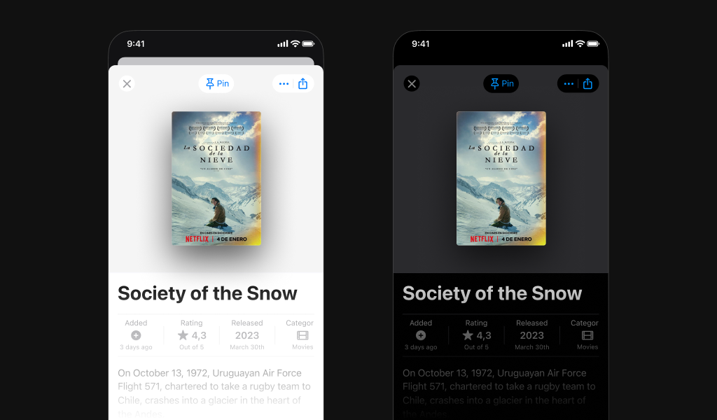
After validating the palette in light mode, the last step is to adapt it to dark mode. This does not involve a simple swapping of light colors for dark; the shades must be adjusted to maintain adequate contrast for each combination of background and text. It is advisable to make final adjustments by testing in real context to ensure that the experience is equally effective and accessible in both modes.
How to implement color tokens: Consistency and design flexibility
What are Color Tokens?
The design tokens are variables that represent design decisions, such as colors, spacing and fonts. They centralize these values, ensuring consistency across different platforms and equipment. They have several advantages:
- ConsistencyAvoid arbitrary values in the designs.
- Flexibility: Facilitates adaptation to light and dark subjects.
- Scalability: Allows you to create new UI components without the need to modify or add new colors.
Here are some examples of how to create design tokens for native mobile applications on iOS, Android and also in pure CSS.
Practical examples (simplified)
CSS
:root {
  --primary-text: #000000;
  --background: #FFFFFFFF;
}

@half (prefers-color-scheme: dark) {
  :root {
    --primary-text: #FFFFFFFF;
    --background: #000000;
  }
}
iOS (Swift)
extension UIColor {
    static let primaryText: UIColor = {
        if UITraitCollection.current.userInterfaceStyle == .dark {
            return UIColor.white
        } else {
            return UIColor.black
        }
    }()

    static let background: UIColor = {
        if UITraitCollection.current.userInterfaceStyle == .dark {
            return UIColor.black
        } else {
            return UIColor.white
        }
    }()
}
Android (XML)
<resources>
    <color name="primary_text">#000000</color>
    <color name="background">#FFFFFFFF</color>
</resources>
<resources-night>
    <color name="primary_text">#FFFFFFFF</color>
    <color name="background">#000000</color>
</resources-night>
Creating these color tokens can be a tedious task, causing the developer of each platform to have to manually go to Figma to copy the color values and names. This can also create inconsistencies in the long run if these values are updated in Figma but not on all platforms at the same time.
To automate and make this process more robust, you can create scripts that run in «pipelines»that connect with the Figma API and generate a code output of all design tokens for each platform.
Conclusion
Accessibility is more than a legal requirement; it is an opportunity to improve the user experience and reach a wider audience. Using color tokens, adopting perceptual models such as APCA and leveraging modern tools simplifies compliance with WCAG 2.1.
Also if we automate all the token management and deployment on iOS, Android or Web clients, we will have an agile and accurate way of working with the development team.
Here are a couple of examples on how to create accessible color design tokens for large digital products: Lyft: Re-approaching Color y Stripe: Designing Accessible Color Systems.
Extra ball:
If you are also interested in the technique of how to combine colors in an attractive way, you can also see this color analysis of Disney's Aladdin movie. And if you want more articles about design, we leave you the first part of design basics. here.

